If you’ve designed or built a website before, you may have heard the term “accessibility.” All businesses or content creators with websites should know about website accessibility and how it can improve user experience and benefit their reputation and sales. So what is web accessibility? Accessibility refers to initiatives that help individuals with disabilities use websites, making content more accessible to screen readers and adhering to design principles that make website content easier to read
Website accessibility allows more people to interact positively with your brand, generates more traffic, and improves your reputation. Depending on where you live and operate, accessibility may even be a legal requirement.
Why Is Accessibility Important in Web Design?

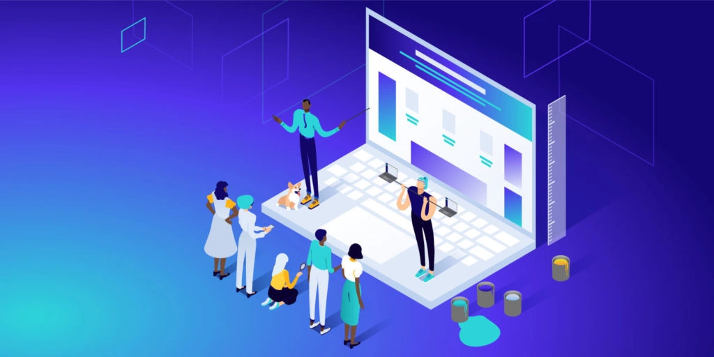
Source: kinsta.com
To make your website more accessible for individuals with disabilities, you’ll need to work with a web designer and developer who can help. Some aspects of design, such as using certain contrasting colors, can improve accessibility for those who are color blind or have limited sight. Accessibility also improves user experience, boosting your SEO efforts to help your website pages rank higher in search engines.
How Can Web Design Improve Accessibility?
Web design is important for accessibility, but you should also consider website development. Developers can use many backend processes to improve accessibility, especially regarding how screen readers read different aspects of the website and in what order. That being said, the design still plays an important role. Here are a few ways web design can make information more accessible:
-
Alt Text
In most cases, a website designer won’t handle your alt text for you, but anyone with SEO or development
experience can. Alt text is for visually impaired website users and is used in place of images, illustrations,
and other graphics you might use on a website. A screen reader reads the alt text to help the user understand
what content is on the page, so they can still get the same information as everyone else, with or without the
ability to see the graphics. -
Multi-media Alternatives
Multi-media alternatives, such as video and audio alternatives, are also a good way to make information more
accessible. For example, someone who is hearing impaired might appreciate being able to read transcripts of a
video or podcast. In addition, something as simple as adding captions to a video can be beneficial to increase
information accessibility for all. -
Navigation
Easy navigation is important in web design without considering accessibility, but it’s even more crucial when
designing a website accessible to everyone. Your web pages should be accessed using a keyboard or adaptive
technology since not everyone can move a mouse to click a button or menu. Your site structure is also important,
and search boxes, site maps, and menus should have intuitive navigation to help anyone find what they’re looking
for. -
Color Contrast
Color contrast can help individuals who are colorblind easily navigate a website. High-contrast colors on your
website are easier to read, especially for those with poor vision. For example, using a dark background with
light text can improve visibility, ultimately making information more accessible. However, every user is
different, so you should allow them to change the colors in the web browser to improve their experience. -
Forms
If you use forms on your website, you likely want users to take action. However, if someone can’t read the
information on your form, they won’t know what to do next. Users with disabilities may need a label next to the
field to tell them what they should be entering. In these cases, adaptive technology would know what to do to
fill in the blanks. -
Moving Content
If you have content that moves, such as flashing, blinking, or changing content like advertisements, videos,
sliders, or gifs, you’ll need to consider users with cognitive disabilities. Your website should have a limit
for changing content that allows it to be turned off. Content that blinks or flashes can cause seizures,
especially in those with photosensitive disorders, so if you have moving content, you should be aware of the
potential implications to prevent your website from causing harm. -
Text
Websites are meant to be read, but not everyone reads the same way. The text on your website can help
individuals navigate web pages since screen readers use titles and content hierarchy to read page content. You
should always use headings to help users understand page content, especially when relying on screen readers and
keyboards.
Web Accessibility Tips

Source: Medium.com
Now that you understand the importance of accessibility and how web design can enhance it, you may need a few tips to help you make your website more accessible. By following these simple guidelines, you can help more people effectively use your website:
-
Allow Keyboard Navigation:
Keyboard navigation allows anyone to navigate your website without using a mouse. Assisted technologies use keyboard-only navigation, so you should ensure your website doesn’t need a mouse to operate properly.
-
Use Contrast Colors:
Some visitors may find it difficult to read the text if you have low contrast. Therefore, it’s always best to use high-contrast colors like black and white that ensure users can read every aspect of your website, including buttons and website copy.
-
Alt Text:
You should always provide alt-text for images, especially those that enhance the website copy. Your alt-text should describe the image to help users further understand the content on the page.
-
Use Heading Hierarchies:
Always use heading hierarchies to structure your website and organize content. While it might look nice to use a variety of headings, it’s not the best practice, especially regarding
website design. Accessibility depends on your ability to prioritize and organize content to help users and screen readers interpret the information on a page easily. -
Add Captions:
Adding captions to videos is a great way to help hearing-impaired website visitors understand the content of a video. You can also use transcripts to help them read through it faster. You can add captions to videos fairly easily using several available tools.
-
Consider Form Design:
Your forms must be easy to generate leads. If you don’t make the fields clearly labeled, it can confuse users of all types. Always place labels near their corresponding form fields to provide easy-to-understand instructions and increase your form submissions.
Easier Access to Information
Everyone has a right to information on the web. If your website isn’t accessible, you could lose thousands of customers to the competition. In addition, you want to share your message with everyone, so those with disabilities should be able to access any information on your website.


